Bluemine
IBM has been a technology leader for more than 100 years due, in large part, to its ability to stay ahead of the market and continually reinvent itself. Doing that requires that IBMers have a way to access the latest market intelligence and research quickly and easily. That's what Bluemine offers— by aggregating market intelligence and research from subscription-based services into one place, users don't need subscriptions to each vendor's site.
In early 2017, our team undertook the application's first major redesign, overhauling its information architecture, design experience, interface language and technological infrastructure with an overarching goal: to create a simple but comprehensive community for consuming, monitoring, and sharing market insights.
Timeline
- October 2016 - Formed and hired an in-house design team
- April 2017 - Project Kickoff
- December 2017 - MVP Release
- 2018 through 2019 - New Feature Releases
Design Impact
- Redesign surpassed revenue projections its first six months
- Reduced Bluemine publishers' time of posting new content from 30-90 minutes down to 5-15 minutes
The problem to solve
Background
Bluemine is an intranet application that serves nearly a third of IBM employees— approximately 125,000— from around the world. Since 2003, IBMers have come to Bluemine for its deep repository of market insights and, once there, can discover market information, share market intelligence with colleagues, and follow the latest market trends.
User problem
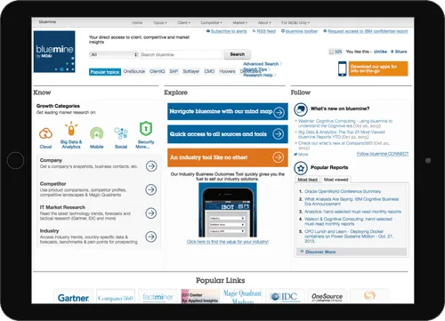
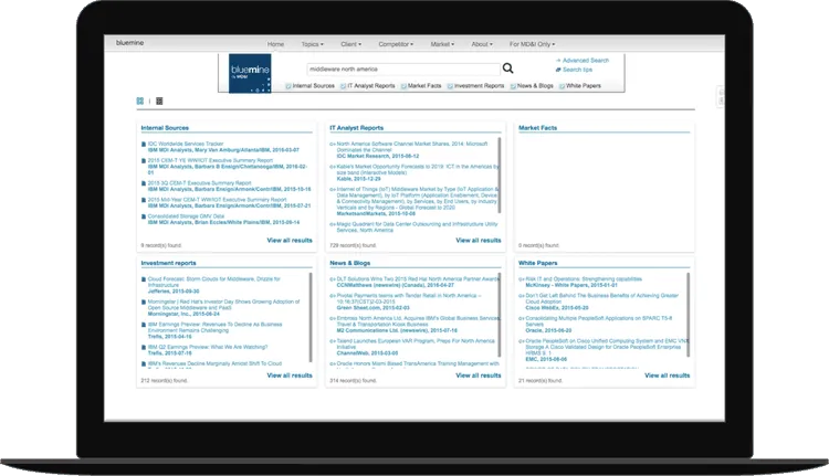
Over the course of 14 years, users begin describing the application as hard to navigate and overwhelming in information. With limited resources and a strict adherence to IBM's intranet regulations, efforts to improve user experience upon legacy code were challenging. As patchwork features were appended, the overall experience suffered. The platform felt disjointed and "Franken-knitted."
My role
As Bluemine's product owner and design lead, I drove project vision, set our product roadmap and priorities, and directed four design workstreams.
I managed a design team of 14 UXers on a product team of ~50. I scoped and allocated work; pushed our team's craft through weekly design reviews; and advocated design decisions to stakeholders and partners.
I partnered with Bluemine's tech lead, two product managers, and two marketing/analytics leads to plan sprints, prioritize features, and make product decisions.
I championed my team's work internally across IBM Design as well as shared the success of our redesign externally by writing and submitting our work to StepTwo and Nielsen Norman Group for award consideration.
"In short, awesome! [Ally] allowed people to shine and take the lead on their own work, while being a very strong, reliable, trustworthy leader. Advocacy is a good word too. Patience to teach and mentor, giving us enough direction to move forward without dictating designs."
Bluemine team member
- Apr 2017 - Project kickoff
The design team hosted a 2-day workshop with our marketing, development, and business partners to kick off ideation as a response to early research findings. I planned the activities and agenda for the full workshop, and I co-facilitated sessions with members of my team.
- Dec 2017 - MVP release
The successful launch and migration from legacy to new Bluemine included redesigns of homepage, search, and publishing. I facilitated design reviews, showcases, prioritization meetings, and iteration planning leading up to the launch.
- Apr 2018 - Award submission
As primary author, I wrote and submitted a case study of over 140 pages detailing out my team's research and design process of Bluemine's overhaul. The case study was submitted to Nielsen Norman Group and StepTwo Intranet for award consideration.
- Oct 2018 - Curated homepage
Bluemine's homepage was enhanced with the ability for the team's internal marketing and enablement teams to push editorial content about market trends to Bluemine users. I was the final decision maker for the design and features that were launched.
- Jan 2019 - Channels release
The release of Channels created a place for IBMers to quickly post news, links, share thought leadership and engage with other community members in a live forum. A direct report had come up with the idea of channels in summer of 2018. I empowered him and a lean project to rapidly prototype a concept for IBM wide beta testing.
Insights
Study
Research purpose
One of the first goals of this effort was to prioritize major IBMer painpoints of using Bluemine.
*After launching an IBM survey with 527 completed responses, 40 IBMers volunteered to be interviewed by our design team.
Research method
IBM is a global company with Sales, Marketing, Services, Offering Management and other roles that span across the world. Because we had heavy users that were based in the US, Asia, Europe, Africa, and South America, most of our interviews were conducted online through Zoom or WebEx. We asked IBMers to:
- Describe their experience using Bluemine
- Tell us about a recent search they did. What were they looking for? What did they find?
- Tell us where they spend most of their time when it comes to Bluemine
- Tell us what was working well and not not working well
High level insights
Bluemine's experience was inconsistent and outdated.
- Many landing pages often got in the way of getting directly to the desired content, especially for pages that were rarely maintained.
- Search didn't always come back with relevant results; at times, reports dating back five years would appear in top results, thwarting user expectations.
- Finding market answers was time-consuming. Because of how search was structured, IBMers often had to read through many reports to find a key nugget of information.
Publishing was time-consuming and complicated, which dissuaded many IBMers from contributing to Bluemine.
- Publishing took 30-90 minutes to post content that had already been written as a report, and another 24 hours before the content would go live.
- The publishing tool's categorization and selection criteria were out-of date and complicated to use.
Challenges
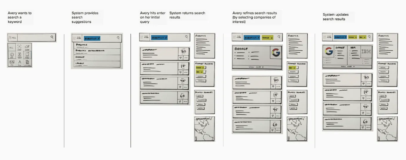
#1: We struggled to figure out the "right model" and design for search.
Improving search
Because of search's design structure and outdated algorithm, existing metrics weren't useful. User interviews supported our assumptions that the rigid design forced people to behave in a way they didn't want to
Users cited Google as a complementary way of getting market intel, so we used Google search and filters for design inspiration
Product risks
- Designing an interface on top of a new algorithm (that didn't yet exist) without know what results might look like
- Simply copying Google's search design without the power of its search algorithms would likely mislead user expectations
#2 We struggled with politics and relationship management when the redesign included culling and combining content.
Culling content
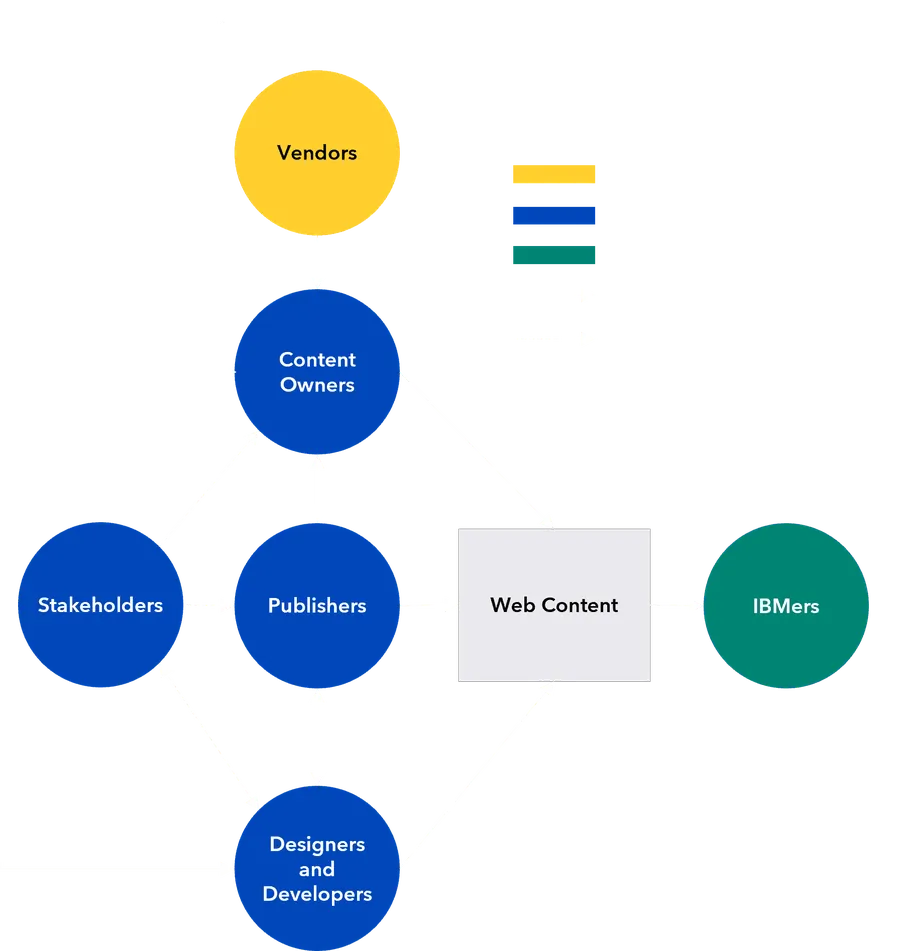
- A redesign of our content ecosystem affected 668 pages, 126 tools, 1800 internal active reports, 88k links to external reports, 50 content owners, 350+ IBM publishers, 16 executive stakeholders, and 125k users
- Over 30% of pages had not been updated in over two years, but we could not simply kill off unused content
Product risks
- Unintendedly killing off valuable content due to Bluemine's design weaknesses biasing existing metrics
- Potentially damaging relationship between organizations who contributed to Bluemine's repository of insights
What we did
The biggest risk was pushback on removed content. So we ran the cull with 16 executives and 50 content owners, working through what was out of date, what could be combined, and what had low versus high engagement. Making owners part of the cull turned it into shared ownership of what remained.
Our solution
Simple, but comprehensive
Users want to find market intelligence, key insights, and IBM's perspective on topics quickly. Publishers want to get thought leadership and data in front of users as quickly as news and trends unfold in the market.
What we did
Improved navigation, flexibility, and efficiency of searching marketing insights and publishing content. Created Bookmarks for users to save and organize insights
Web-responsive, content fluid
Although only about 1% of legacy Bluemine use came from mobile, consultants struggled to use the native app in place of the web version. Users want to quickly find answers no matter when, where, and how they choose to access the site.
What we did
Responsive, content-first design which eliminated the need to maintain two experiences; removed fixed-width UI issues; gave users access to the same content no matter what real-life context they're in
Design impact
User Satisfaction
Prior to the redesign launch, NPS for legacy Bluemine sat at a -1 in November 2017. 6 months after MVP launch, NPS was +14.
Publisher Time Savings
Publishers can submit thought leadership in 5-15 minutes (opposed to 30-90 mins), leading to over 50% publisher time savings in content creation. In addition, publishers gained the ability to publish instantly without a 24-hour waiting period.
Home
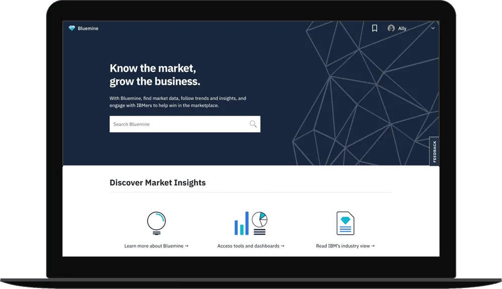
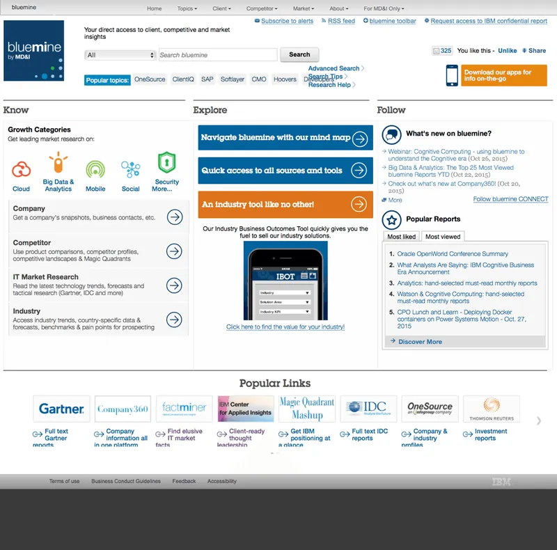
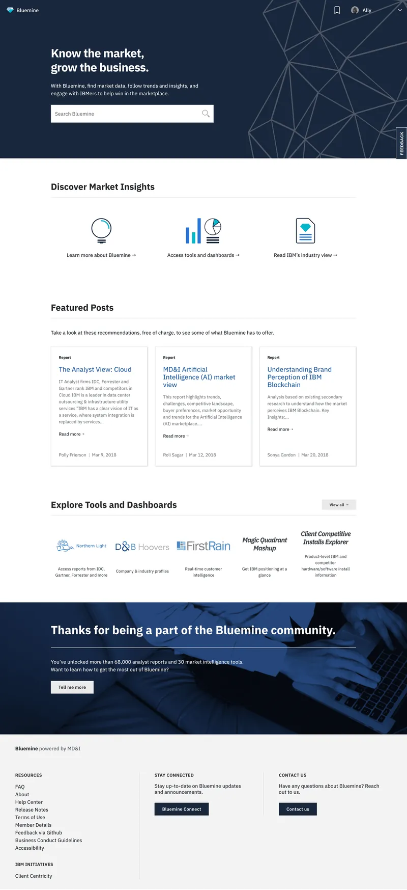
The old page wasn't responsive, and search, the most-used feature, was buried in a link-cluttered homepage with no hierarchy. We rebuilt it around search and ordered everything else by what analytics and user testing showed people cared about most.
Before - 2016
After - 2018
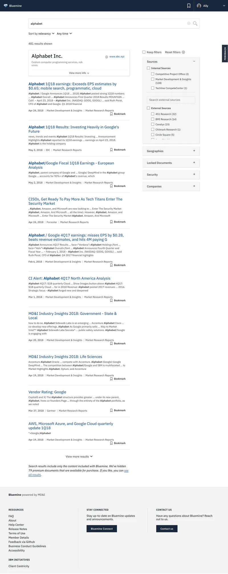
Search
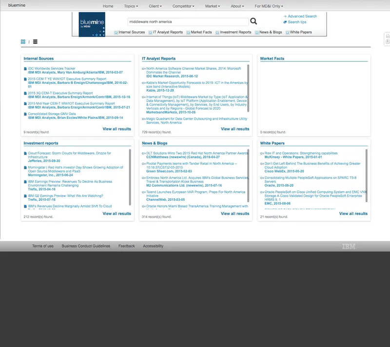
Search forced results into categories that didn't match people's mental model. We moved to relevance-first results, with filters such as report type so people could narrow results their own way.
Before - 2016
After - 2018
Publish
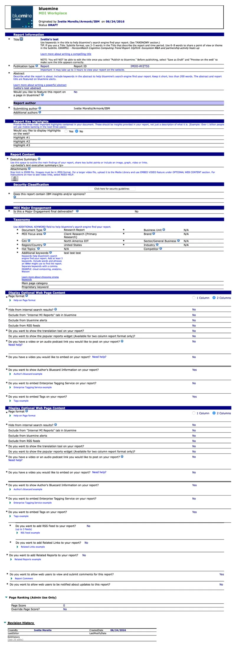
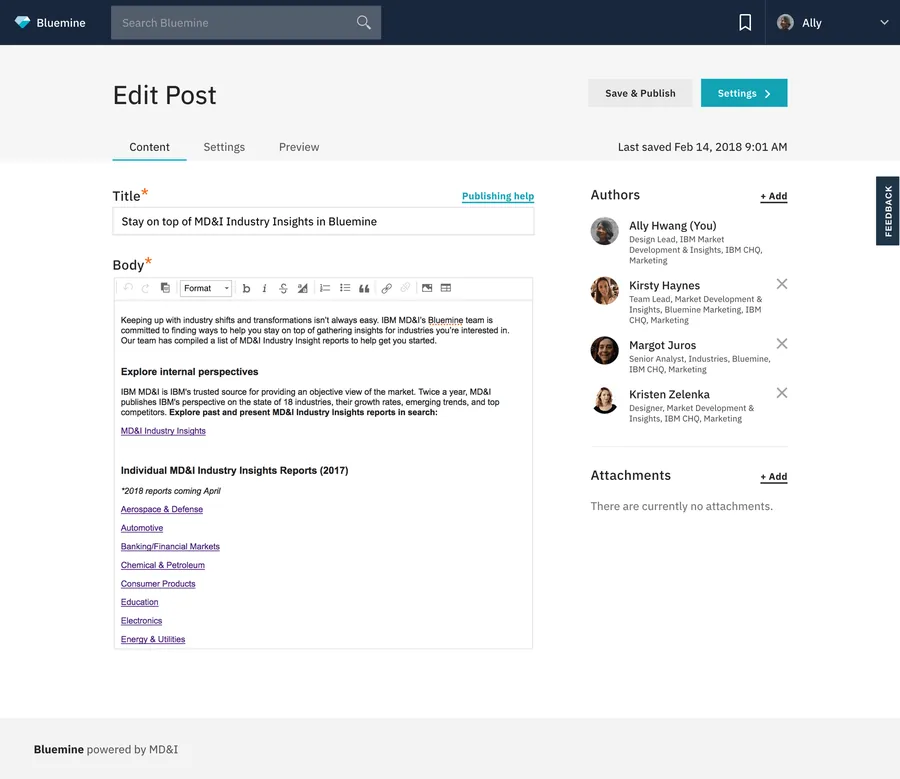
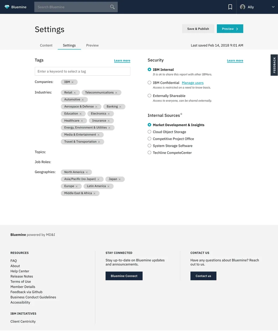
A single 50+ field form split into Content and Settings tabs, and publishing went instant.
Before - 2016
After - 2018
Insights
10-10-10 Study
Research purpose
In January 2018, a month after MVP was deployed, I led our researchers in conducting a round of research that would help gauge user adoption at the behavior level. The goal of that research, dubbed 10-10-10 Testing, was to follow a group of users over a period of time to see how their habits and behaviors changed.
Research method
Our research team conducted interviews with IBMers through a longitudinal study that would observe IBMers using Bluemine.
The first 10 minutes: First impressions of the new design from first-time and long-time users. We observed how they navigated and used features to assess intuitiveness and ease of use.
After 10 weeks: Short-term adoption. Were they still using Bluemine, how often, and which parts? Was it fitting into their workflow and meeting expectations?
After 10 months: Run in October 2018 and compared against the 10-week results. Were people still using Bluemine, what set power users apart, and how had it become part of their workflow?
High level insights
First 10 minutes: users called the redesign modern and simpler, with three gaps.
- Price confusion: 12 of 12 users didn't understand the interdepartmental charge.
- Search wasn't prominent: 6 of 12 missed the homepage search box.
- Search relevance: compound searches like [topic + geography] returned weak results.
After 10 weeks (7 of 12 users): three themes.
- Only daily users noticed what changed, and they focused on what still fell short.
- Users still struggled to go beyond the search bar, and relevance was still an issue.
- 4 of 7 had changed roles, but their search needs hadn't, so we should minimize gating content by job role.
"[Bluemine] is one of our better efforts as a company."
— IBMer, 10-10-10 Study
Retrospect
Successes
The greatest success with Bluemine was reducing time that IBMers spent searching for and publishing market insights so that they could focus on more important work matters.
Apart from myself, all design team members and more than half of developers were hired in 2016 and 2017. We quickly learned how to work together collaboratively to deliver an MVP product in nine months.
Failures
In the first month of launching the redesign, there was confusion around Bluemine subscription costs. The interaction struck fear in IBMers who didn't understand the back-charge and worried they would get in trouble with their managers.
Learnings
While we spent a lot of time testing prototypes, microcopy was always the last step to be completed. We learned that writing good copy is an important part of design, which can make or break the user experience.
Testing the new search design was often done in a controlled environment as cognitive walkthroughs or with designated search prompts. Having users search with a small database of only 2,000 reports helped us get a more accurate read on if search design was meeting expectations.